Maps
Maps for The Road of Hope and Sorrow: the Western Front
I am creating these maps to illustrate my bike tour along the Western Front. This is a work in progress and a few examples are shown here.
The maps provide information at three levels:
Level-1: A single map showing the location of the Western Front from the Belgian coast to the Swiss border, with all of the main battles that determined the position of the Front by late October 1914
Level-2: A set of three maps showing my bike route
Level-3: More detailed maps showing my route on each day of the ride and exploration of stories from Amédée Tardieu’s memoirs
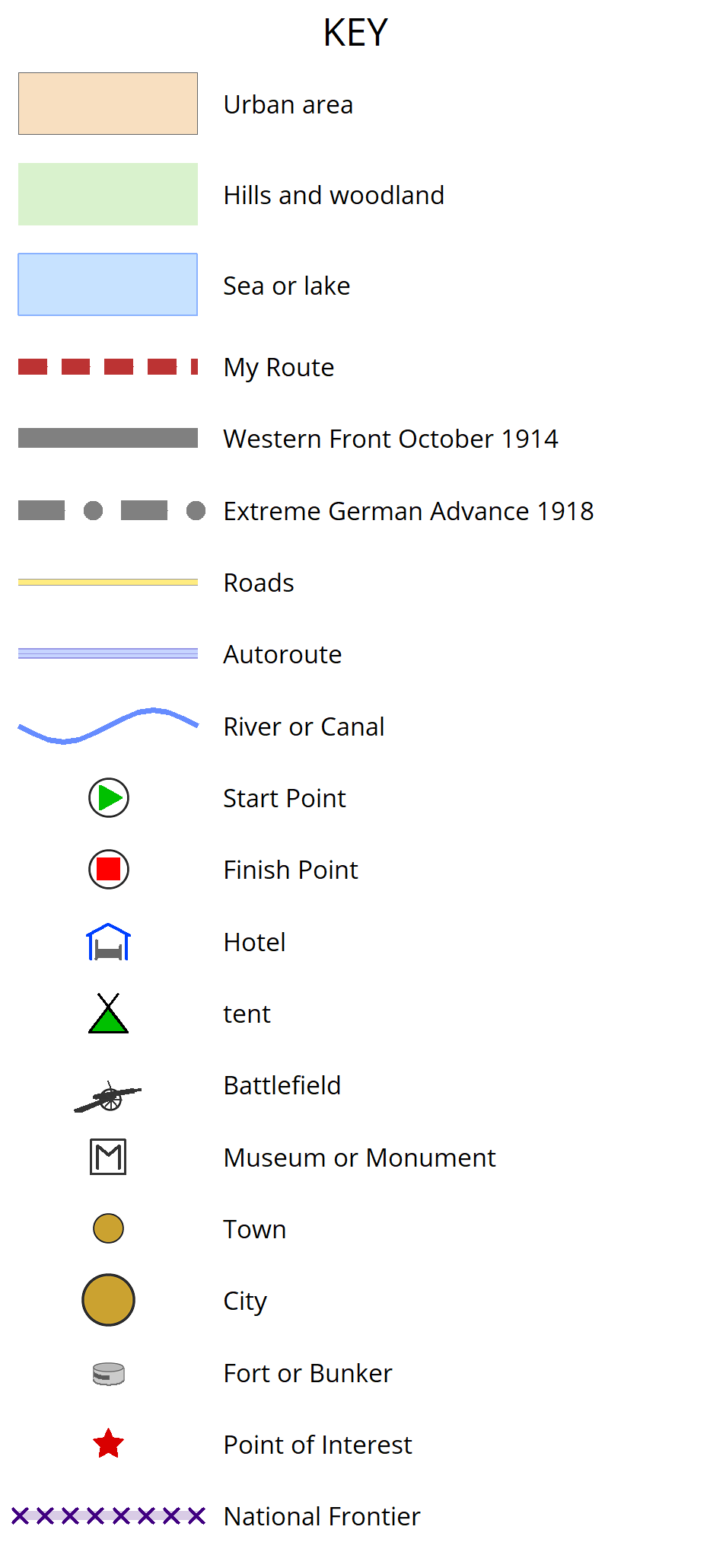
A separate example Level-3 legend is also included in the gallery.
I have georeferenced all of these maps to ensure the scale and orientation are correct, as follows. I downloaded the GPX files of each day’s route from Garmin, and projected these using the WGS84 Datum and Lambert-93 EPSG projection code in MapMaker 4. This allowed me to identify two clearly defined points near the start and finish of each day, and record the X and Y co-ordinates for each point. I then applied these coordinates to a JPEG image of the relevant part of the French IGN map, which served as a template for drawing my maps. To respect IGN copyright, no part of the original maps has been copied.
All of the Level-2 and Level-3 maps will include drawings. Some of the drawings featured on maps in this gallery have initial sketches, or unfinished drawings – I am still trying out ideas on technique and choice of subjects for each map.
Photos of my Western Front ride are available in the Travel and History Gallery
Part A_Dunkerque to Seraucourt_v2_crop_1920 px
The first section of my ride along the Western Front, covering Flanders, Passchendaele, Arras and the Somme
Day 5_Aubers to Arras_v2_1920 px
Ride from Aubers to Arras, passing Notre Dame de Lorette – France’s largest military cemetery – and Vimy Ridge with the Canadian National Memorial
Ypres salient_v5_1920 px
Ride around the ‘Ypres Salient’, a bulge in the Western Front skirting the city of Ypres
St Mard_cave walk_v3_1920 px
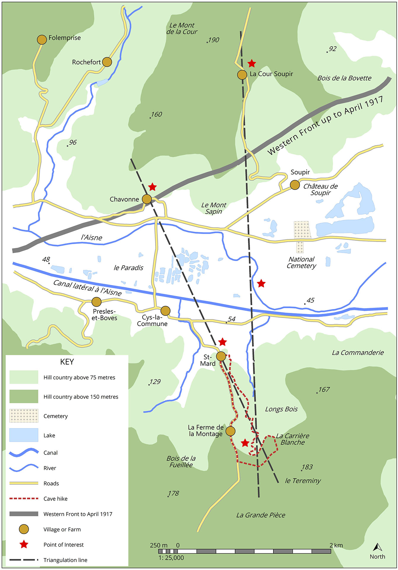
Area around Soupir and St Mard in the Aisne Valley, with a walk taken to explore locations described in the memoir of French artillery officer and family member Captain Amédée Tardieu
Route des Cretes_1 to 150000_v4_river 80 m_1920 px
Map of ride from Plainfaing to Thann along the ‘Route des Crêtes’, a French military road built early in the Great War to supply the front line which ran close to the border with the German Empire
Maps for use in Community Health Worker training – Kenya
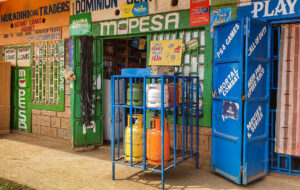
I have created these hand-drawn maps for a health worker training manual. This is part of a new initiative in Kenya to build the capacity of community health workers (CHWs) to encourage and support households in switching away from inefficient, polluting and unsafe fuels such as wood and kerosene, and adopt clean fuels including LPG and electricity.
There is more on this topic on my Environment and Health page, and in my feature artciles, for example: The drive for clean household energy in Africa: experience from the front line in Kenya
During the training, CHWs are asked to assess the availability of both traditional (e.g. wood and charcoal) and modern household energy (e.g. LPG and electricity) in the locality of the training centre, and record this information on a maps. The examples in this gallery are designed to help the CHWs by showing them what these may look look like for one urban and one rural community.
These local maps are then used for discussion among the CHWs about opportunities and barriers for local households in making the transition to cleaner energy, with support from their trainer.
Following training, CHWs are encouraged to use community mapping as a tool for change, through discussion with other local stakeholders and the community.


Community mapping is used to assess the availability of various energy sources, or the lack of it
Infographics
Plans:
This is a work in progress. I am planning to develop Infographics for application in feature articles and other publications. I will probably use Adobe Illustrator.
I am intending to use infographics for illustrating:
- Trends in and influences on the household energy transition, historically and as currently taking place in low-income countries
- Key historical events and themes leading to the outbreak of the Great War


